Learning Outcome 3 (U20): Create production materials to be used in the original media product (M3, D2)
M3 (U20): Explain how the created media components comply with the codes and conventions of the media sectors
What are codes and conventions?
Codes and conventions are repeated easy of constructing media. This is something that has been used many times and over a long period of time. This has then been accepted by the audience and then taken on by them as what to expect when viewing a certain type of media. Conventions are elements and themes that are commonly seen in specific genres. When it come to these codes and conventions they are see to make media. These codes and conventions are followed throughout the process of creating media, in order to make them classify as a type of media.
Billboard:

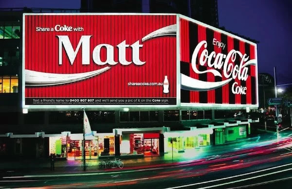
The main components of a billboard are the logo of the company, the logo of the brand, the slogan. They usually are bright or have complementing colours to attract the attention of the consumer, the main feature of the billboard would be that it is straight forward and is direct in what it wants. This is shown in my advert as I’ve made sure the logo of the brand is a different colour to the background, hence makes the title/ logo very bright. Also with the slogan, I have made sure that when creating the billboard that its very bold and eye catching. The wording of the billboard is simple and isn’t too descriptive since it is meant to be eye-catching rather than wordy. I have incorporated this in my advert, I have made the wording very minimum as I have only included the slogan and the main ingredients of the product. The fonts of used in billboards are usually large and have an easy to read font due to the fact that the billboard would be far away from people so it should be easy to read and simple wording since some of the younger or older generation would may find some words hard to pronounce or to read. I have included this in my advert as I have made the writing of the logo large so people can see it from afar. I have also made the slogan large as well since that is the second major writing on the billboard. For drink adverts that are promoted on billboards, the company logo is at the top either left or right hand corner and the slogan/ tagline would be underneath the logo since people read left to right, top to bottom, like how they read books. This is why I have made the writing in my advert larger and I have incorporated this in my advert as I have to make it obvious what the logo of the campaign is. The billboards are also very high up which means that more people can see it, more likely. The drink adverts obviously show the drinks since it is a drink advert. The drinks are usually shown somewhere where it would be eye-catching. They are either in the middle or to one side and they would be in a big size to make sure the audience know what the advert billboard is about. This is why in my advert, I made sure the drink can would be in the centre due to the fact that it be more eye-catching to the audience and will also get the idea across to the audience. The slogans on billboards are simple and very easy to remember, they usually are similar to name of the logo of the brand or even the company. This is shown in my advert as the slogan is ‘ Phizz it up’ which is similar to the name of the product of the drink and it is simple and easy to remember. The billboard was inspired by the share a coke billboard advertisement. The positioning of the coke drink is in the same position as the one in the advert I have created. The slogan and the position of the logo in my advert is in the similar way that the coke advert is in. This is due to the fact that the billboards have certain codes and conventions that the brand follows.

YouTube advert:
A code and convention of YouTube adverts is that shows people are having a great time and them enjoying the drink with those that they love. The advert usually consists of each scene involving the drinks including the idea that the drink is one that is enjoyable and memorable for all. Another convention would be that the ends of the advert would have a similar concept to the posters, billboards and social media posts. In the advert that we produced, you can see that the end of the video advert it shows a similar way that we conveyed the social media posts and the billboard. The drink at the end of the video advert, is in the centre and is very similar to the other media we have created. A convention of adverts would be that the drink is always the main part of the advert, in every take the drink is shown and the drink is the highlight of each take. This is incorporated in the video advert we created, as it shows the drink in every take and shows the drink and the substances in it. In the advert we created, you can see the substances inside of the drink even if the can isn’t shown in the take. Another convention would be that the advert shows the drink close up and far away as well as what is included in the drink, such as the substances that is in the drink. It usually states that the drink is natural and is healthy. This is shown in our video advert as it shows the audience and people what to expect when consuming the drink. In the advert we also show throughout the advert what is included in the drink as well as whether the drinks healthy or not. The adverts also include the website and what the slogan is at the end to signify the brand and the campaign. This was incorporated when creating the video advert because then people could tag the drink into any post that they take which could help make the campaign more viral. The websites where it can be found as well as the social media pages were incorporated at the end of the video advert since people can read through while the VoiceOver is taking place. Also at the end of the video advert, it shows the drink with a background as well as the voiceover. When creating the video advert we made sure the voiceover was included at the end due to the fact that some people may be blind which means they can’t see it, but if they hear what it is called then they can try to find the product. These conventions have been met when we made the YouTube advert because of the fact that the advert shows how the drink is made, as well as the substances and ingredients inside of the drink. This shows the audience what to look for when drinking the product. The filming of the product has a combination both modern and contemporary filming techniques so that it can encourage both target audiences to be drawn to the product.

Social media advert:

A convention of instagram adverts when it comes to fizzy drinks is that to has the product and has that as the main thing and the part that people have see when looking at the product. Another code and convention of social media adverts would be that they are simple and they usually have a hashtag as their slogan to make sure the product goes viral on all platforms. This was shown when I created the social media post, as I made sure that the only thing included on the advert was the name of the campaign/ product and the slogan. This is because of the fact that not many people within the audience actually read the adverts properly. The less on the advert, the more the target audiences will take in. They normally consist of a simple background and they sometimes have celebrity endorsement who would use the product to promote the product. I incorporated this in my advert as I made sure that the background was simple but still had a vintage and retro vibe to follow what the client brief asked for. Even though there wasn’t any indication of this, I made sure the background had a neutral colour so that people would think that the drink can attract both genders. When it came to the brand and the campaign, Share A Coke campaign, there was a lot of celebrity endorsement, for example, they had Selena Gomez promoting the campaign on her social media page which made the campaign go more viral. At the start of the campaign, I didn’t have any celebrity endorsement, but in order to make sure the campaign went viral I made sure there was a slogan that had a hashtag. This is because of the fact that hashtags are known to have a massive effect of campaign. They are known to make the campaigns more viral and well known to people. The social media advert that I completed meets these conventions because of the fact that it is simple but effective and it has the information needed but not too much to then make the advert become overloaded. The background is simple due to the fact that it is meant to attract the audience and not make them read too much and become overwhelmed with all the information. The post just consists of the drink and a little information and the slogan and logo of the brand and the company.


D2 (U20): Demonstrate how the technical and aesthetic properties of the media components meet the client brief
Billboard:
I made sure I met the client brief when producing the billboard as I made sure the name of the logo was Phizzwizzard and made sure the company name and logo was added on to it. This made the audience know what the name of the product is and what the campaign is based on. The client made sure that the drink has the flavouring of strawberry laces, this is why the colour of the can is pink and why the name of the logo had a pink outline. It also required for the advert to include that the the ingredients of the drink is natural, it asked for us to include that there was natural colouring's and flavourings inside of the product. The client also required for the drinks to be produced into cans, this may be because of the environment. We then followed the brief and produced the product within a can which is the same size of a coke can. The client also asked for the drink to be aimed at a retro audience of 30 year old and another target audience of young people aged 13-18 years old. In order for it be retro, I made sure the background had a retro vibe and made sure the background had a gender neutral background. Even though that wasn’t requested by the client, I thought then it would attract both genders. The client also hoped that the campaign would go viral, in order for this to occur I made sure that the campaign included a slogan with a hashtag since it would encourage people, especially those on social media to tag it into a post.
YouTube video advert:
I made sure I met the client brief when producing the billboard as I made sure the name of the logo was Phizzwizzard and made sure the company name and logo was added on to it. This made the audience know what the name of the product is and what the campaign is based on. This was shown to be the name of the brand and campaign due to the fact that it was seen on the can as well as at the end of the advert. The client made sure that the drink has the flavouring of strawberry laces, this is why the colour of the can is pink and why the name of the logo had a pink outline. The ingredient of strawberry laces was shown in the advert as it showed the product included strawberries and to be specific strawberry laces. It also required for the advert to include that the the ingredients of the drink is natural, it asked for us to include that there was natural colouring's and flavourings inside of the product. This was shown when we dropped the products, you could clearly see that the writing indicated what the drink had inside of it. At the end of the advert it also specified what was included just in case the audience didn’t have time to acknowledge the information that was given to them. The client also required for the drinks to be produced into cans, this may be because of the environment. We then followed the brief and produced the product within a can which is the same size of a coke can. The client also asked for the drink to be aimed at a retro audience of 30 year old and another target audience of young people aged 13-18 years old. In order for it be retro, I made sure the background had a retro vibe and made sure the background had a gender neutral background. I also made sure that the background music in the advert was a well known song that people of both target audiences knew. It had to be well known so that people could remember the drink when they listen that specific song. Throughout the entire campaign advert, the background was a pastel colour, this is due to the fact that through researching the retro, vintage style we found that pastel colours are more eye-catching for the audience, that includes the young audience as well.
Social media advert:
I made sure I met the client brief when producing the billboard as I made sure the name of the logo was Phizzwizzard and made sure the company name and logo was added on to it. This made the audience know what the name of the product is and what the campaign is based on. This was shown to be the name of the brand and campaign due to the fact that it was seen on the can as well as at the top left corner of the advert. I made sure that even though it wasn’t indicated in the brief that the name of the brand the campaign was displayed at the top left corner, this is because of the fact that people read the first thing on the top. When people read social media adverts, they read it similar to how they read books, left to right and top to the bottom. I also made sure that the background of the advert would be retro and vintage, this is because of the fact that the client asked for the adverts to include retro images. The background, even though it wasn’t asked by the client, was made to be neutral in colour as well as eye-catching otherwise people wouldn’t remember the advert. This was also made as a neutral colour due to the fact that I thought then it would attract both genders since some people may think that it is for women due to the colour whereas that is not the case. The can, as shown in the advert, also has a retro vibe and vintage look and this is because the client asked for the can to be colourful to attract a retro audience as well as a younger audience. The client also asked for the drink to include a pink, red kind of colour for the drink. I showed this when I showed the splash of the drink under the can. I made sure the splash was close to the can because then it would signify that that’s what the drink looks like inside. The client also hoped that the campaign would go viral, in order for this to occur I made sure that the campaign included a slogan with a hashtag since it would encourage people, especially those on social media to tag it into a post.
Legal and ethical issues:
One main legal and ethical issue with fizzy drinks is that there is a high sugar consumption. With fizzy drinks they are known to have high sugar levels. Drinking high sugar soft drinks is most commonly associated with obesity and type 2 diabetes. This can also have a potential side effect on your teeth and can lead to tooth decay and cavities. Regular consumption of sugary carbonated drinks adds to calories to your diet which may increase the risk of being overweight and obese. However the benefit of Phizzwizzard is that there is no added sugar, there is also only natural colouring's and flavourings which is a positive of the company, but the only thing that the company can't change is the acidity of the drink since it is required to produce the carbon inside of the fizzy drinks which creates the fizz in the drinks. This is a positive and therefore wouldn't result in the company getting a bad reputation and getting s stereotype of having added sugar and causing health risks.

Another legal and ethical issue could be that libel could occur which is information of a product being correct and not incorrect. If the information is incorrect it could lead to the customer being mislead and being told and informed with the wrong information. It needs to ensure that the information is correct otherwise the company and drink brand would get a bad reputation. It may only affect the consumer/ customer and the company since it puts a constraint on the idea a put in the brief. However with Phizzwizzard, we made sure that the information on the adverts, which are the social media post, YouTube advert and the billboard all consist of the same product and same information. The information on the can is the same as the information on the adverts to make sure the audience don’t get confused on what is what.

Copyright would also be affected when considering the background music included in the campaign advertisement. This would be resolved by asking the company which owned the music if I could use the music in the YouTube advertisement. This copyright is easily fixed and mended by the company. When making the video advert for Phizzwizzard, we added the song ‘ Dancing in the moonlight’ and we made sure this was a karaoke version on the song since the lyrics aren’t needed on a well known song. We made sure that we handled the copyright since this is a legal issue which could go out of control is not handled properly.

A different issue would be the increase of aluminium cans. The increase of pollution of cans is due to more companies using cans to reduce plastic pollution. Even though that is a major problem, the company has decided to include the label of recycling to make sure that the cans are being disposed of correctly and not used to pollute the water. The brand made sure to include the fact that they can recycle the can rather than causing extra pollution in the water. Including the recycling label means that people will known that they can recycle the can to reduce pollution in the earth.


Comments
Post a Comment